
It Comes in Waves: Game Art
- scottbdejong
- May 3, 2021
- 6 min read

This post is part 5 in a series of interviews with the developers of the game “It Comes In Waves” - a research creation game set to release in late spring 2021. The goal of these interviews is to discuss the thought and consideration that went into the game, acting as one method of archiving the process, thoughts, and decisions that go into making social impact games. This post is a collection of thoughts gathered from interviews with the Production and Narrative Team: Courtney Blamey, Lyne Dwyer, and Michael Iantorno.
I had the opportunity to virtually sit down with Tamyres Lucas (or Tamy), the lead art designer for the project. Tamyres, originally from Rio de Janeiro, is an MA student at Concordia University whose work beyond this project explores representations of violence against women in video games. For the project, they were solely responsible for making the game’s images and worked hard to design a diverse cast of characters and environments without falling on stereotypes.
For them, one of the initial challenges was shifting the gauntlet from critical researcher to artist:
TL: “I research a lot about the theory behind how characters are being represented and the social issues behind video games, but it is another thing to actually put your hands on and design the characters. Because you realize that it is really easy to rely on stereotypes without realizing that you are reproducing them. So it's completely different from being a researcher who criticizes and analyzes the representation that other artists produced and being in the position where I am designing characters and being aware of those representations.”
Compounded on top of this swap in position, one of the most challenging parts of working on the project for Tamy was having to create a large amount of characters in a relatively short amount of time (3 hours for each character). This meant that they needed to come up with a time-efficient method for art design that still allowed them to think through the uniqueness of each character. To do that:
TL: “I looked for pictures of real life people. I looked for pictures of people who are diverse who are pictured by other diverse photographers and artists. So I would go to google images, look for postures and use a variety of photos for reference. Postures that would represent a characters personality but at the same time their feelings and how they experience them.”
However, this provided its own challenges. By taking a bunch of images and summarizing it into one image that described how the character was presented to the world, captured their personality and alluded to a background story. This required help from the writers. They would point out details or character traits that Tamy might not be entirely aware of.
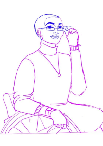
Tamy applied this method to all of the art, from characters to backgrounds. She took the time to talk through some of the specific characters in the game and the thought that went into their creation. First up she discussed Patricia, a queer woman who uses a wheelchair. Patricia is an academic and has quite an independent personality. Tamy wanted Patricia to be a person of colour to counteract a common stereotype about which bodies can exist in academia. First she had to find images for reference and layer some of them onto one another. According to Tamy:
TL: “It looks weird, ok, but as I was looking for referencing many of the photos are quite stereotypical so I wanted to address that. I made this decoupage and then would draw over the reference.”
Tamy sought other opinions on this as well, asking colleagues for suggestions on diverse presentations and images or artists whose work she could reference. However, the image made it hard for Tamy to figure out the details of the characters' clothes and posture, so she photographed herself and used that to expand on the images she found. From this she was able to draw the first draft which was eventually coloured (Figures below).


Patricia’s example is focused on the visual elements. However, Tamy discussed how another character, Elena, was a good example of how she (with the help of the team) thought through personality traits and backgrounds in an image.
TL: “Elena was a challenge because she has a chronic gastro-intestinal disorder, which gives her constant pain. However, we don’t want that pain to define her. It needs to show how she is uncomfortable from the pain but also offer glimpses of her personality. Initially, I had a posture that communicated this discomfort (Figure Below) which would be okay if she had more than one image, but as a single image I needed to highlight her personality a bit more beyond the chronic disease. The narrative team had a great idea to move her hand from her forehead to her pocket. This made it so one hand showed that she was in pain, while the other suggests that she is trying to chill despite the pain.”


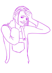


In terms of personality, Tamy wanted to make sure she was approachable. The slight smile on the face, a more open posture, and a hand in the pocket helps communicate this to players. For example, if you compare it to a less approachable character, the grocery clerk, you will notice the distinct change in how approachable the characters were. The clerk has their arms crossed, no smile, and eyes that seem both tired and supervisory, which offers a change of appearance compared to Elena (Figure 3 Below).

Importantly, the characters were also placed in specific environments. Tamy thought through the different homes that the protagonists visited and how the space would be constructed. This is one space where discussions of economic class position might be noticeable in the game. According to Tamy,
TL: “This environment (Figure 4), which is different from the other facility, had to represent one that was struggling financially. It is not a place where you will see dirty things, it is clean, but it will be filled with old stuff. We [Tamy and the design team] decided to go with a 70s vibe. It was an efficient way to show that they used to have nice things but they are old now, because they do not have the money to buy modern stuff. I used reference images for colours, patterns and furniture.”

It was important that the space reflected class position and the pandemic, while also being recognizable and functional for a care home. This came down to even the finer details.
TL: “If you look closer at the image, you will notice that the armchair has a book underneath because one of the legs broke so they had to fix it quickly with a book. The sofa, the couch at the front, has parts that are discoloured from liquids falling onto it and they tried to clean it but actually damaged it more. At the same time, the lamp on the right - the head is missing. So when they were organizing and cleaning the place someone lost it and because it was old they didn’t have another cover to replace it. Another example is the wall. You will see that the wallpaper is scratched. I wanted it to be the most obvious example because I want people to immediately start thinking about how it was damaged.”
Tamy made stories for her art that exist beyond the actual game. The pieces in the game reflect a multiplicity of images and include specific detail in how each part of the scene is presented. Given more time Tamy would have preferred to create more iterations of characters and scenes, but with the constraints she attempted to have one image say as much as it possible could. This project was a fantastic learning opportunity for her and she closed the interview with these words,
TL: “At the end, instead of watching tutorials or going to class to have people tell me what to do, I learned a lot with the tight schedule and time crunch. It pushed me to learn so much. I did not know before this project how it was to learn in the act of making things. Because of that, I am more than open to opportunities like this in the future.”


Este artículo ofrece una mirada fascinante al proceso creativo detrás del arte de los videojuegos. Me parece especialmente interesante cómo cada personaje y entorno comunica identidad, emociones y contexto social. significado de los números El significado de los números también puede despertar curiosidad y reflexión en diferentes aspectos de la vida.
Mình có lần lướt đọc mấy trao đổi trên mạng شيخ روحاني thì thấy nhắc nên cũng tò mò mở ra xem thử cho biết. Mình không tìm hiểu sâu rauhane chỉ xem qua trong thời gian ngắn để quan sát bố cục s3udy cách sắp xếp các mục và trình bày nội dung tổng thể. Cảm giác là các phần được trình bày khá gọn, các mục rõ ràng nên đọc lướt cũng không bị rối Berlinintim, với mình như vậy là đủ để nắm tin cơ bản rồi. q8yat
The content is very informative and well explained, providing readers with useful knowledge that is easy to understand and apply effectively.
https://gamerterbaik.wordpress.com/
شيخ روحاني
رقم شيخ روحاني
الشيخ الروحاني
الشيخ الروحاني
شيخ روحاني سعودي
رقم شيخ روحاني
شيخ روحاني مضمون
BERLINintim
جلب الحبيب
Sometimes the simplest games are the most addictive. Help the bunny collect carrots in this charming and challenging online game! Poor Bunny tests your reflexes and ability to anticipate patterns as you navigate treacherous levels filled with obstacles. It's free to play in your browser, making it super easy to jump into for a few minutes of fun. It’s got that retro arcade feel and can be quite satisfying when you finally clear a level that’s been giving you trouble. A great little time-waster in the best possible way.